The Blandemic
When everything looks right, but nothing feels quite right
There is a particular kind of interior that has become almost impossible to avoid. You see it everywhere. In magazines, across social media, in homes that are beautifully styled and impeccably photographed. Pale timbers. Soft neutrals. Bouclé. Linen. Stone. Everything layered, tonal and quietly resolved.
The irony, of course, is that many of the ingredients themselves are timeless. Natural materials. Soft palettes. Simple forms. These are all part of a considered design language. But when applied without nuance, contrast, or a clear point of view, they become a formula. The formula is efficient. It produces results that are widely acceptable, easily photographed, and unlikely to offend. But it rarely produces anything memorable.
After many years working with homes—and more importantly, with the people who inhabit them—I’ve come to understand that the most successful spaces are not the most perfect. They are the ones that feel particular. The ones that hold a sense of memory, or personality, or even contradiction. A piece that doesn’t quite belong, but somehow completes the room. A colour that isn’t expected, but feels entirely right. A decision that reflects a person, rather than a reference image. These are the moments that give a space its identity. Its soul.
At first glance, it feels calm. Considered. Effortless. And for a moment, it is. But then you pause. And you realise you’ve seen this room before. Not just something similar—but something almost identical. The same palette. The same materials. The same carefully calibrated restraint. Different houses. Different locations. The same room.
What we are seeing is not simply a trend, but a kind of design standardisation—filtered through social media, refined by algorithms, and repeated until variation is gently removed. Spaces are no longer shaped by place, or by people, but by a collective understanding of what is considered “good.” It is design that has been agreed upon. And agreement, while comfortable, has a way of flattening everything it touches. I sometimes think of it as The Blandemic.
Not because these interiors are unsuccessful—they are often beautifully executed—but because they are missing something harder to define. A point of tension. A sense of authorship. Any real indication of who lives there. They are, in many ways, interchangeable. And that is where the problem lies. Because a home should never feel interchangeable.
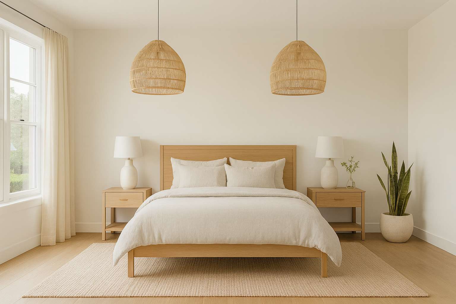
A palette reduced to its quietest expression — calm and considered, but at risk of losing the depth and character that give a space its identity.
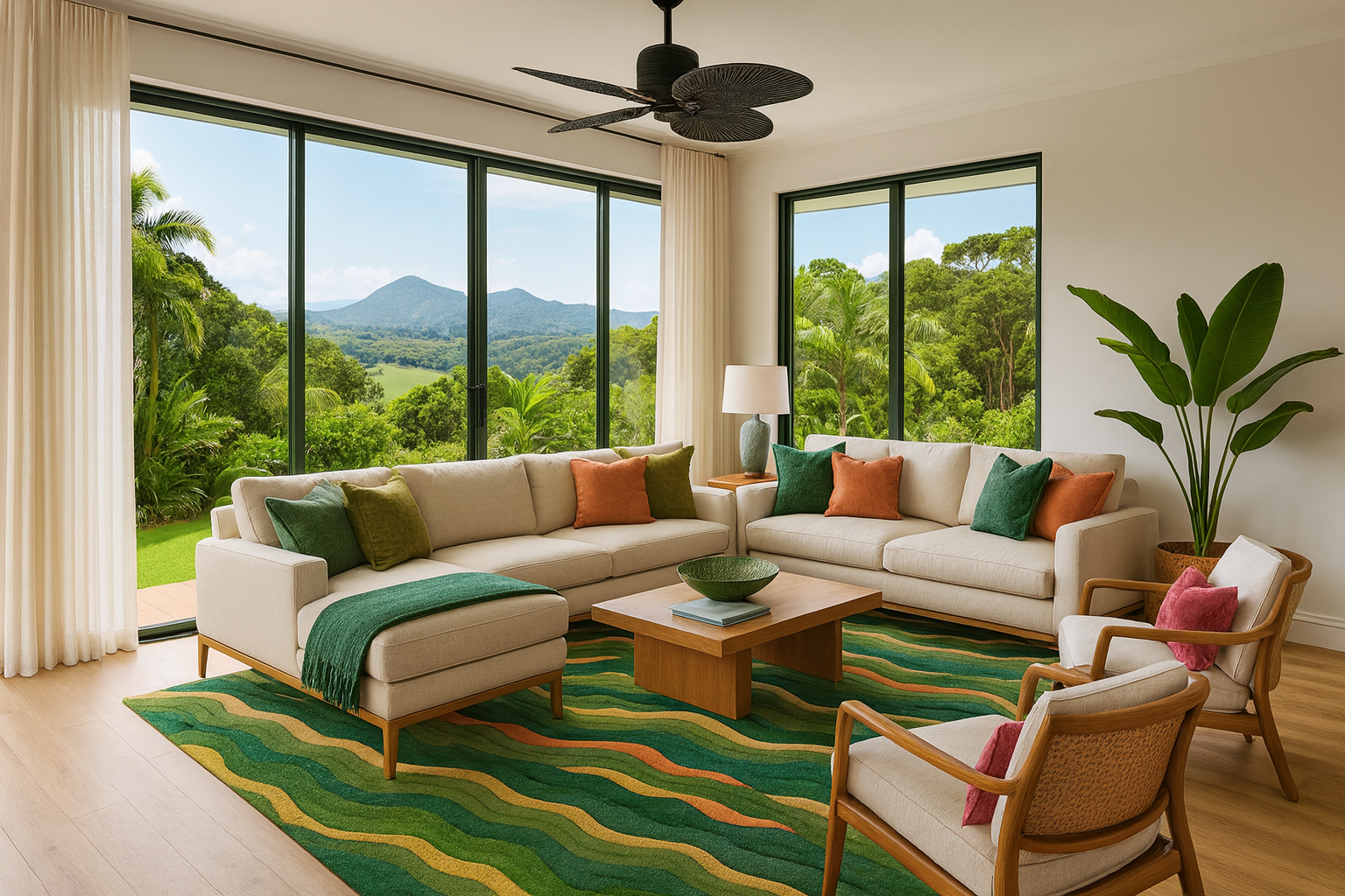
ABOVE: The inspiration for this room comes from my rug design, Waves, in the Tropical colourway, where shifting tones of blue and green echo the layered landscape of Tropical Queensland.
This does not require excess or dramatic gestures. It requires conviction. A willingness to step slightly outside what is universally approved. To allow a space to reveal something of the person who lives there, rather than smoothing everything into a single, agreeable outcome. Because a home is not meant to be widely liked. It is meant to be deeply felt.
And perhaps that is the quiet resistance: In a landscape of perfectly resolved interiors, choosing to create something that is individual, layered and human, something that may not appeal to everyone, but resonates completely with the person it belongs to.
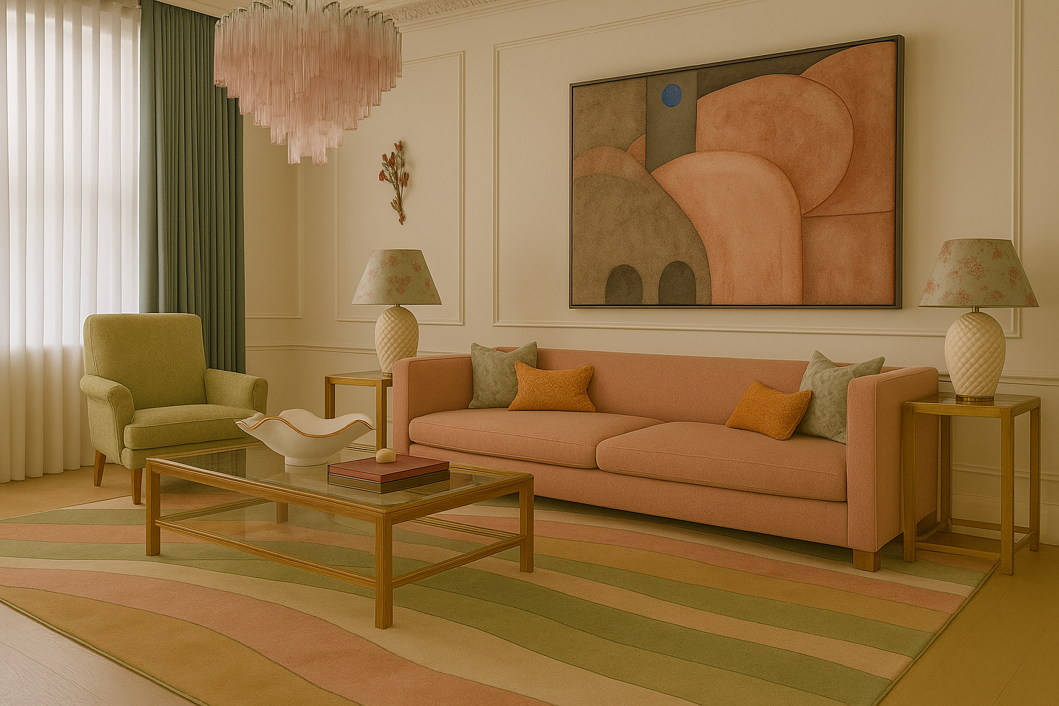
LEFT: The inspiration for this room comes from my rug design, Organic Flow, where softened pinks and layered greens introduce a more expressive palette, balanced by the structure of a classic interior.